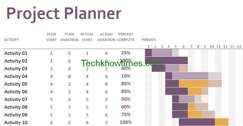
To keep up with Project Timeline template earlier, we present gantt chart excel template. The purpose gantt chart excel template is for scheduling the projects or events. Gantt chart excel template is free and open source, which is totally perfect for software house, event organizer, or personal freelancer.
THE GANTT CHART EXCEL TEMPLATE MENU
Gantt chart template excel only has one menu.

However, the menu has several elements:
1. Activity: the task name or title.
2. Duration: the time spent for each activity or task. It is consist of 5 columns:
- Plan Start: the planned starting periods for each task
- Plan Duration: the planned length for work on and completing the task.
- Actual Start: the actual starting periods for a task.
- Actual Duration: the actual length of completion time.
- Percentage Completion: the actual completion status in percentage in current period or time.

3. Gantt diagram: display the Gantt chart based on Periods and the duration. The Periods can be determined as days, weeks, bi-weekly, or months.
4. Legends: on the top right of excel Gantt chart template. It displays the color symbol and period highlight.
HOW TO USE
First, change the “Project Planner” text into the Project Name with Project ID (optional).
On Activity column, enter the task name. You can add new column for WBS (work based structure code) and row for milestones. If you want to add new row for task, insert the row between the provided activity (before activity 26).
On the Duration columns, enter the appropriate starting plan, planned duration and complete percentage. You can update the Actual start, duration, and complete percentage later.
The Gantt Chart will automatically display the bar chart based on Duration fields.

Based on the legends, we can conclude:
1. Activity 01 has not been started at all. The Actual time has not been determined. The bar is shading without highlight on background.
2. Activity 02 has been completed in time. The bar is bold purple.
3. Activity 03 has been completed faster than expected duration. The bar consist of bold purple for completion time, and shading without highlight for remained time.
4. Activity 04 bar consist of bold purple and shading with background highlight, meaning that the actual duration equals with planned duration, but has not been completed.
5. Activity 05 bar add the red shading, meaning that the actual duration exceeds the plan or late.
6. Activity 06 display bold orange bar, meaning completion percentage after late time.
7. Activity 07 display the bold orange bar and red shading bar in opposite, meaning that the activity started earlier before the plan.
Next, select the period highlight by manual typing or slider. Period Highlight will highlight the Gantt diagram column (in picture below). Period highlight function is for determining the current period, as well helping in looking the period in really long activity list.

MODIFYING THE TEMPLATE
Currently, there are only 60 periods. You can add more period column, but the highlight may not be displayed properly. After you add latest period column, do these steps:
1. Select the slider icon. Right click and select Format Control.

2. On Control tab, change the maximum value depends on latest period columns number. Click OK
3. If you notice that the highlight only displayed on Period Number, scroll until Activity 26. On Activity 26, you will see that the column is highlighted. Drag the field to copy it to upper column field.
If you want to change the bar color, go to Page Layout tab > Color > Customized Color. Determine the color in Accent 01 to 06. However, this may change the rest of gantt excel template color, which you can changed manually.
CONCLUSION
The free gantt chart template is open source and free to modify.
Gantt chart excel template is easy to use. You only need to enter the time period and the bar will automatically change. It’s easy to modify gantt chart excel template too.
You can download gantt chart excel template after click this like buttons: